Pump Up Your Vocabulary

words

(photo art by Darwin Bell, Creative Commons license)

Stuck in a rut when you’re writing and want to find some fresh words for your ideas? Not sure where you stashed that dusty old thesaurus? If your vocabulary needs a bit of a boost, the Just English website has produced a gaggle of synonyms for the 96 words that are most commonly used in English. While the list doesn’t replace a thesaurus (online, I’m a fan of Visual Thesaurus), equally interesting is what those 96 words are.

Who would guess these most frequently used words would include crooked, idea, neat, and predicament? Some of the commonly used words cited include alternative slang definitions, which undoubtedly increase their usage, but Just English doesn’t provide synonyms for these.

Anger, angry, awful, bad, fear—they’re all there. A few more alternatives for “bad” than for “good,” but perhaps it means something positive that we have 27 alternatives for “beautiful,” and only 19 for “ugly.”

By age four, children know some 5,000 words in their native language, and children of age eight know 10,000 words. The average adult who is a native English speaker has a vocabulary of 20,000 to 35,000 words, and most adults learn about one new word a day until middle age. The New York Times is happy to help with that. A bit more challenging assortment can arrive in your email inbox from A.Word.A.Day.

Teens who read “lots” have about twice the vocabulary of those who read “not much”—more than 20,000 words, versus about 10,000. While reading builds vocabulary, and people who read “a lot” throughout the lifespan have a bigger array of words in their communications repertoire than do non-readers, what they read matters. On average, people who read fiction “a lot” have larger vocabularies than people who do not—even if they read a lot of non-fiction.

You can test the size of your vocabulary here. More than 5 million people have taken this test; I did, and my estimated vocab size is 37,000 words.

27 Maps about English & America

language tree

Ellis Island Language Tree (photo: Colin Howley, creative commons license)

The English language is rich and diverse—and so difficult to learn, especially the spelling—for reasons made amply clear by the first map in this fascinating series. The English language has grown root and branch from a wide diversity of linguistic traditions.

Moreover, English is full of idioms derived from all these different cultures. (A friend who is a native German-speaker wanted a book to read to improve his language skills, and I suggested The Big Sky, a 1947 novel about the American frontier by Pulitzer Prize-winning author A. B. Guthrie, Jr. It’s told in the plain language of the era and characters, and I thought it also might shed light on the formation of the American outlook, pre-1970 or so. Big mistake. Although the vocabulary was easy, the book was so shot full of idioms, phrases an American reader would understand at once, it was impossible for an outsider to parse.)

Back to the maps. Others of particular interest include #7, the accompanying text of which points out that the pronunciation of American English today is closer to 18th-century British English than what current British speakers use. The changes that occurred in British English in the 19th century led to the dropping of the “r” after vowels, which elegant Hollywood stars of the 1930s and 1940s would emulate (“Chahles, wheah did you pahk the cah?”) and other pseudo-elegances, leading inevitably to Singin’ in the Rain’s “I cahn’t, cahn’t, cahn’t.”

#13 is a map of Europe showing where English-speakers can most likely have a conversation in their native language. More than 95% of Britons can carry on such a conversation, as can 39% percent of people in France. Whether they will do so is a separate question, though the French I’ve encountered have shown great patience with my fumbling attempts at their language.

Don’t miss #22, which is a reprise of a video that made the rounds some months ago, a woman demonstrating 17 different British accents. First up is the “received pronunciation” that straddles differences across regions, akin to what we think of in the United States as newscaster-speak, or, more technically, as shown in map #24, “General Northern.”

“General Northern” has replaced a “truly astonishing” number and variety of language families present on the North American continent when European explorers arrived. Few of these American Indian languages survive today. This story also is graphically told on these two maps, accompanying Orin Hargraves’s Visual Thesaurus story on “The Continent of Lost Languages.”

Just Your Type

(photo: wikimedia.org)

(photo: wikimedia.org)

Curtis Newbold, “The Visual Communication Guy,” runs a website about topics in good design. He says “it’s as important for (people) to be literate in visual communication these days as it is to know the fundamentals of grammar.”

He’s created a nifty infographic, “18 Rules for Using Text” if you’re intrigued by graphic design, web design, and just generally making the stuff you print out look better. The graphic is also available from his store in poster form, in case you have a bare patch on your office wall.

I look at a lot of websites and can attest to the fact that these rules are violated often. And, while they aren’t rules in the sense of “never do this,” they are certainly rules-of-thumb. Red or yellow type on a black background? No, please. Going crazy with fonts? Amazing how many people still do this. A list like this is a good reminder of these most common mistakes–which are “mistakes” because they discourage readership. Something none of us want to do.

(photo: Vicki Weisfeld)

(photo: Vicki Weisfeld)

Let there be . . .

birthday cake, candles

(photo: pixabay)

This week Orin Hargraves posted an illuminating essay on his Visual Thesaurus blog in tribute to the designation of 2015 as International Year of Light. Light, says Hargraves is “one of the most productive concepts for metaphor in English.”

Metaphors about light relate not just to our dependence on light for seeing (“light of day”; “leave a light on for me”), but, more profoundly, on light as a fount of understanding (“shed light,” “puts a new light on the matter,” “I see, . . .”). By contrast, dark suggests not just not seeing, but also not understanding (“in the dark,” “unenlightened,” “a cloudy perception”). No surprise, then, that the original meaning of “obscure” was “dark, opaque, gloomy.”

I picked up my copy of Lakoff and Johnson’s Metaphors We Live By, then found Hargraves consulted them on this matter, too. The two linguists cluster these and many similar metaphors under the rubric “Understanding is seeing; ideas are light sources; discourse is a light-medium.” Their examples include “What is your outlook on that? I view it differently. Now I’ve got the whole picture. It was a murky discussion.”

The relevant metaphors extend from direct references to light and dark to more indirect ones (“point of view”; “a transparent argument”; “lamp of knowledge”; “it dawned on her”; versus “someone not too bright”; “he’s a dim bulb”) and once you start looking for them, you find them embedded everywhere. In fact, Hargraves says, “there is hardly a noun, verb, or adjective in English with a core meaning arising from light and vision that cannot be used in metaphoric extension to depict knowledge and understanding.” And, to a great extent, the obverse. The full essay is a great read. Enjoy!

A random closing thought, but is it possible that birthday candles are a subconscious but resonant metaphor for the accumulation of understanding gained with each passing year?


The Dictionary in 2014

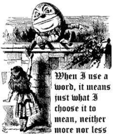
Alice in Wonderland, words, Humpty DumptyIn his September column for Visual Thesaurus Orrin Hargraves comments that in pre-Internet days, as if we could remember back that far, dictionaries carried “a certain authority.” They not only satisfied writers that they were spelling and using words correctly, but they also resolved tricky dinner-table arguments. But today, dictionaries may be as likely to start those arguments as to settle them.

Because the Internet enables a much wider discussion and debate of word meanings, people have available to them a wider range of information on which to base word choice, giving dictionaries a run for their money. When using foreign words, I rely on the Internet site WordReference.com for straight meanings and its wide selection of idioms, but I also use its discussion threads in which native speakers debate usage and suggest how they would express an idea. Very helpful, especially with slang, which changes more rapidly than more formal speech.

Hargraves says the dictionary “is no longer regarded as an anchor of certainty on the reference shelf,” thanks to the usurpation of its role as arbiter by the lightning speed and facile opinions of the Internet. He cites this example: a recent BuzzFeed article took Merriam-Webster to task for defining “pit bull” as “a type of dog that is known for its strength and its ability to fight.” In its irrelevant objection to this characterization, BuzzFeed posted numerous cuddly pit bull photos. Dog-lovers rallied. And BuzzFeed concluded Merriam-Webster had some cleaning up to do.

These fans should have read the British dictionary definition and encyclopedia entries regarding pit bulls provided by dictionary.com! The inconvenient fact that the “ability to fight” was developed through decades of deliberate breeding was ignored; the definition was treated as a value judgment.

Hargraves’s second example came from Quora, where a user asked, “Which is more correct: ‘have a bar mitzvah’ or ‘get bar mitzvah’? Hargraves notes that the most popular answer endorses neither of these usages, in favor of “to become (a) bar/bat mitzvah.” While the original meaning of the term did refer to the child, in current usage, it most often refers to the ceremony. “Usage, that old tyrant, has nearly eclipsed the original meaning of bar/bat mitzvah in the majority speech community,” he says, “and usage is in fact what determines what words mean.”

Despite such debates, dictionaries will continue to base their definitions on actual usage, so people who don’t like the definition of pit bull and those defending the original meaning of bar mitzvah have a lot of usage-changing to do. But don’t blame Messrs. Merriam and Webster: “Dictionaries merely document the evidence.”

Your Brain Has Priorities

typo, misprint

(photo: David Sim, CC & cropped)

My second novel. 78,000 words. Respectable length, not one that would panic an agent or publisher. (Unless you’re Stephen King or Dona Tartt, forget the 700-page doorstops. ) I’ve read all the advice to new writers: get an editor (I’ve been editing people’s stuff for . . . a long time—skip that step), have it proofread (pfout! I can spot a typo like Annie Oakley nailing the ace of spades). Hit the send button, set the big envelopes on the postage scale, and trundle them out to the mailbox. Done!

Except. Except that every time I look at my perfect manuscript, I find, horrors!, a typo. A word missing. An editing faux pas. Have I blown it? Big time? Nick Stockton’s recent Wired article on why we miss our own mistakes sheds some light on the problem. “Typos suck,” he says. “They are saboteurs, undermining your intent, causing your resume [or the novel you’ve spent two years writing] to land in the ‘pass’ pile.” Spotting other people’s errors, no problem. Like the LinkedIn blurb I saw today for a job-seeker who wrote, “I also have string organizational, self-management and interpersonal skills.”

Our own typos elude us, Stockton says, not “because we’re stupid or careless,” quite the opposite. He quotes psychologist Tom Stafford from the University of Sheffield who says it’s because writing “is a very high level task,” and our brains focus on creating meaning and conveying complex ideas, not dealing with more mundane things. Homonyms and spelling being two. (I’ve noticed my alarming recent tendency to type even the most absurd homonym when I mean something entirely different—the kind of error that makes me howl when I read it in print.) When we read our own stuff, we skip over these mistakes because we know what we mint.

Touch typing was one of the most useful high school courses I took—that and driver’s ed—and I have always made certain errors, typing “d” when I mean “k,” and vice-versa. Or, when I type “Bethesda,” it takes real effort to stop myself from adding a “y” at the end. What I’ve noticed is that those mechanical errors are now so embedded that I make them even when I’m writing longhand. I go through two or three envelopes to get a birthday card out to any of my Bethesday friends.

And let’s not even start talking about numbers. Hopeless. I almost never enter a whole phone number without transposing something. I am a person for whom speed-dial is a godsend. The only thing that prevents matters from being much worse is that, as Stockton reports, “proofreading requires you to trick your brain into pretending that it’s reading the thing for the first time.” That’s where my vanishing attention span is a big plus.

Creativity is UP!

Up, Navy Pilot

(photo: wikimedia.org)

Metaphors We Live By (George Lakoff and Mark Johnson) is a classic study of the way metaphor shapes our understanding of the world. Published in 1980, it dismisses the idea that metaphors are strictly a matter of language, the frosting on the cake of meaning, as argued by various competing philosophical and linguistic traditions. In what I usually read, the search for truth is conducted not by academics, but by a fictional detective, so some of this was heavy going. Where the authors dig into the language, their examples are fascinating.

Lakoff and Johnson are not generally talking about literary metaphors, but rather about the ones so thoroughly absorbed into the language that we no longer notice them as metaphors. One fundamental set of such metaphors reflects “orientation”: up-down, in-out, back-front, and so on. Although some metaphors in this set appear to be more or less universal across languages, others are more culturally determined. In Western culture, many common phrases reflect the metaphor “happy is up” and its opposite, “sad is down.” Examples are:

  • That boosted my spirits.
  • I’m depressed.
  • It gave him a lift.
  • My heart sank.
  • Being up-beat.

Extending this pattern, health and life are up:

  • It’s time to get up.
  • He’s at the pinnacle of health.
  • Lazarus rose from the dead.
  • She sank into a coma.

More is up (this one, we even represent graphically):

  • My income rose last year.
  • The Dow reached a new high.

Having control is up:

  • He’s at the height of his powers.
  • She has control over the situation.

And so on. This metaphor is so pervasive, we don’t notice it. The other orientation pairs are embedded in the language in much the same way, and from the various concepts they signify, they form a coherent way of understanding our world.

Lakoff and Johnson also discuss how we depend on metaphor to help us structure inherently vague concepts, like emotions, in terms of more concrete things we may have directly experienced. Complex emotions, like love or anger, have inspired many overlapping (and sometimes conflicting) metaphors. For example:

  • Love (vague) is a journey (concrete).
  • Anger (vague) is hot (concrete).

The “love is a journey” metaphor underlies statements like: “We’re on the road to romance” (think Sinatra’s: “Nice ‘n’ Easy”); “It’s a rocky road to love.”; “We went in different directions.”; or “This relationship isn’t going anywhere.” The “anger is hot” metaphor leads to: “I was boiling mad”; “Cool it!”; and “in the heat of the moment.” (Icy cold anger is scary perhaps because it’s so counterintuitive.)

I’m trying to understand all this (which is the tip of the tip of the iceberg, you understand) in terms of writing. “We draw inferences, set goals, make commitments, and execute plans, all on the basis of how we in part structure our experience, consciously and unconsciously, by means of metaphor,” say Lakoff and Johnson. The orientation metaphors and their many variants perhaps explain why, a writer’s attempts to create a literary metaphor sometimes miss the mark. Perhaps they have violated this coherent, and implicit language system.

A linguistic exploration of the metaphors underlying emotion seems to me like an endorsement of the frequent dictum: “show, don’t tell.” Simply saying that a fictional character feels love or anger or happiness conveys little to the reader, because readers will have different ways—and many competing ways—of interpreting that emotion, depending on the metaphors through which they see the world. The metaphors underlying those feelings must be expressed—and in some fresh way that is consistent with the existing substrate (safer) or totally new, stretching both writer and reader.

Read more at: The Literary Link and, for some juicy literary metaphors, Welcome to the World of Metaphor.

Research in Fiction

Since I write both fiction and nonfiction (a woman has to earn a living), people often ask about the differences between the two. It’s happened that on nonfiction projects, when those of us involved are struggling over how to present some complex technical issue, my colleagues will say it must be so much easier to “just make it up.” Oh?

Tarifa, Spain

Tarifa, looking toward Jebel Musa, a setting in one of my novels (photo: Manfred Werner, Creative Commons)

Thoughtful fiction writers put an enormous amount of research into their work. Obviously science fiction and techno-thriller writers do. It’s the grounding in realistic possibility that lets the reader travel alongside them. Writers in other genres do, too, perhaps less obviously. Research is why I joke that the FBI may show up on my doorstep any time now, given the amount of Internet digging I’ve done into terrorism and weapons. General research on these topics provides an endless stream of ideas and themes for plot development.

In last week’s post, I wrote about the importance of “details.” Research is also how the writer develops and manages those details and avoids errors. If I need a tree in the yard of a house in Princeton, I know what grows here (weedy locusts, draped in poison ivy). But if the house is in Rome, I have to find out what kinds of trees I’d find there. Then I can write that the patio was “thickly shaded by a fragrant sweet bay tree,” rather than “there was a tree in the yard.” Such specific details make a story more vivid in the mind of the reader. While it takes a few seconds to read those eight words, it may have taken an hour to do the research and weigh the arboreal options.

I remember reading a thriller set in Washington, D.C., where a character took a cab and checked the meter for the fare. Alas, in that time period, D.C. cabs used a zone system for establishing fares. There were no meters (there are now). Neither the author—nor his editor—had Washington cred, and I don’t want my readers distracted by such slip-ups.

Research provides essential local color. One of my plots takes the protagonist to Tarifa, Spain. I’ve been to Tarifa, but I can’t say I remember it in detail and didn’t take many pictures. So I did photo research, creating a file of streetscape snapshots that helped me envision where the characters walked, the kinds of restaurants they ate in, the weather, and the local youth culture’s kite-surfing obsession. Research on Tarifa hotels gave ideas about room layouts, décor, city views, and the like. So when I write that Archer Landis could look over the rooftops of Tarifa’s low whitewashed buildings across the Mediterranean to the Rif mountains in northern Morocco, I know that is in fact possible.

Research does more than enable accurate and detailed description. It also can uncover details that fuel the plot. In my novel set in Rome, one of the bad guys hides out in Riano, a small town north of Rome. Riano has a public webcam that shows live pictures of its main square. After watching that camera a while, I created a scene in which the Rome police spot Nic and his girlfriend shopping in the open-air market and set the local police on their trail.

A totally different kinds of research I’ve done is to read works in Italian side-by-side with the English translation, to try to get a feel for the language. Whether this has been at all useful, I can’t say, but it was fun. More practical are the discussion forums of WordReference.com where I’ve asked Rome locals about current street slang.

Maps are essential: police precincts, neighborhood boundaries, building layouts, including floorplans I create. Google Maps street-level views and geo-coded photos, ditto.

I am in awe of those who write historical fiction, some of whom have developed encyclopedic period knowledge. Alan Furst (Europe in the run-up to World War II) and Patrick O’Brian (the Royal Navy during the Napoleonic Wars) come to mind. Not only do they have to get the settings and clothing and historical details correct (no war before its time), changes in speech and language have been enormous. A teen character from a hundred years ago cannot convincingly say, “Whatever,” and the author cannot just write whatever, either.

In a recent interview, author Pinckney Benedict describes the research he did for the short story “The World, the Flesh, and the Devil,” which is told from the point of view of a highly trained fighter pilot. Benedict not only read extensively about fighter pilots and how they think, he spent hours debriefing a friend who was a Marine Phantom pilot in Vietnam, and he also cobbled together “a convincing flight simulator” in his basement and spent many hours in it, following the flight path of the character in the story. Research, he told the interviewer, “makes me ecstatic.”

I collect all my research for a novel in a three-ring binder, which includes the photos and maps like those mentioned above. It has a divider for the basics: the calendar for the year the story takes place, the times of sunrise and sunset in the city, and the phases of the moon for the appropriate season. I can’t have a full moon on a Tuesday and another one the following Sunday. I make notes about time zone differences, so I only have to look them up once. It has newspaper or magazine articles generally related to the subject matter of the story and details about clues I’ve planted or weapons used. This notebook is my personal encyclopedia, and I refer to it often. It keeps me consistent. It keeps me from “just making it up.”

You Know Where the Devil Is

In the details, right? Writing my brief review of the nonfiction book Spycraft this week started me thinking about details, because that book provided them in encyclopedic proportion (bad choice for an audio read; I should have bought a dead-tree copy instead). In my own writing and in reading the work of some twenty-five or thirty other newish writers, I’m well aware of the many ways details trip us up.

Writing description is a tightrope walker’s game. Authors have to include enough detail to put a picture (the right one) in the reader’s mind without being tedious. In the Victorian era, readers loved detail, and that’s part of what makes reading those novels hard for many people today, living life in the fast lane. Victorian detail came in long loopy sentences, but less ornate approaches can stimulate pictures in readers’ minds equally effectively. Read Cormac McCarthy to find starkly simple detail, yet surgically precise description: “The night was falling down from the east and the darkness that passed over them came in a sudden breath of cold and stillness and passed on. As if the darkness had a soul itself that was the sun’s assassin hurrying to the west, as once men did believe, as they may believe again” [The Crossing]. (McCarthy also teaches the subtle power of “and.”)

tightrope walker

(photo: wikimedia.org)

When the writer’s balance gets off—too much, too little—problems such as these occur: Pure decoration—a lot needs to be happening at different levels when moving a plot along, and it can be distracting when writers stop the action to explain that a particular weed was “no more than knee-high and had white, daisy-like flowers, each the size of a dime and centered with a bold dot of eggyolk yellow, and erupted in drifts along the dusty roadside,” if those weeds are never going to matter in the story. In Ordinary Grace by William Kent Krueger (recent winner of the 2014 Edgar award), he describes in detail a young punk’s Deuce Coupe, black with red and orange flames painted along the sides. The punk and the car figure prominently in the story, and, in subsequent mentions, all Krueger needs to do is mention the flames and the whole image—in all its symbolism—is brought back.

The irrelevant detail (or “Chekhov’s gun”)—Anton Chekhov famously said, “Remove everything that has no relevance to the story. If you say in the first chapter that there is a rifle hanging on the wall, in the second or third chapter it absolutely must go off. If it’s not going to be fired, it shouldn’t be hanging there.” I hate finishing a book with that “Whatever happened to—” feeling about some vividly described character or thing. Yes, authors can include red herrings, but they ultimately have to be understood as such. At the same time, the groundwork for the resolution of the plot—and in mystery-writing, the clues—must be artfully laid so that the ending seems true, not a deus ex machina, nor totally predictable. Scott Turow’s first book, Presumed Innocent, gave such a neon-lit early clue that I knew the killer’s identity from that page on. Disappointed.

Other common problems are:

red plate, pie

(photo: christmasstockimages.com)

The misplaced detail—It’s jarring to read a long description of a plate, a car, a dress—its shape, material, use, whatever—and then, five pages or paragraphs later, after the reader has formed a firm picture of this plate/car/dress, provide the additional information that it’s red. All such basic descriptive details need to be in one place. And should include the shade of red: cherry, scarlet, maroon. You may ask, what difference does it make whether the damn plate is blue or red? Color matters. I will assume the author made a thoughtful choice.

The lack of sensory detail—to engage readers, details need to vary—not always to appear as if the writer was copying off the character’s driver’s license—and to appeal to more than the sense of sight (“I saw her cooking”). They need to describe characteristics that demand our other senses, too, those we can feel, hear, taste, and smell. Was Mom in the kitchen cooking, or did the clattering pans reveal Grandma had arrived and the rich aroma of sizzling chicken fat mixed with the burnt-sugar smell of caramel assure Sunday dinner would be a feast?

Details about characters—my writing coach, Lauren B. Davis, gave the perfect summary of what to aspire to in describing a character. What to aim for, she said, are details that don’t just tell how a character looks, but who he is. Two examples from Margaret Atwood: “(She wore) penitential colours—less like something she’d chosen to put on than like something she’d been locked up in.” Or “He’s a large man, Walter—square-edged, like a plinth, with a neck that is not so much a neck as an extra shoulder” (both from The Blind Assassin).

To sum up, while details brings a story to life—writers need not too many, not too few, and just the right ones, Goldilocks.

Not My Type

comic sans, gravestone

Comic Sans used on a gravestone (photo: upload.wikimedia.org)

Perhaps you’ve missed the graphic design world’s kerfluffle over Comic Sans. I had. It’s just a simple, unembellished, jaunty little typeface, I thought, but perhaps its very unassertiveness, its cheery friendliness make it ripe for assault by the typographical bullies, confident Times New Roman and sleek (but dull) Ariel? Oh, sure, sensitive people wouldn’t use Comic Sans for an eviction notice or a letter to the IRS, but are we to abandon it entirely? Apparently so, according to this infographic from Comic Sans Criminal, which displays some of those questionable uses.

When Pope Benedict XVI retired, the Vatican published a photo album of his papacy, along with his resignation letter—all in Comic Sans. The designers behind the website “Ban Comic Sans” responded, “As all seasoned graphic designers know, this is a desecration of the cardinal rule of design – NEVER use Comic Sans.” Then they asked, “Among all the apocalyptic speculation is this simply further proof that the end is near?” And a NSFW defense.